'Coral9'
Project Overview
This project was a special one. I was brought on to create the EP cover for an upcoming project from Coral9, a band based in the Bay Area of California—whose music I deeply admire and resonate with. Their sound is powerful, emotional, and totally immersive. Each song feels like a journey through change, love, identity, and everything in between. The goal was to design visuals that felt just as honest and expressive as their music—something that looked like them, felt like them, and could carry the emotional weight of their sound.
Context & Background
Coral9 is getting ready to release a new EP, and while they had a general idea of the direction they wanted to go, they were looking for someone who could really get what they were trying to say—not just visually, but emotionally. We talked about their journey as a band, their influences, what the new EP meant to them, and the possibility to listen to some audio clips of the project. It wasn’t your typical client brief—it was more like an open conversation about identity, vulnerability, and the highs and lows that come with creating something real.
Process & Technique
My process was very much driven by the music itself. I listened to rough cuts of the EP on loop while sketching ideas—sometimes late at night, sometimes during walks. I took notes on how each track made me feel and tried to reflect that in colors, textures, and form. The visuals came together slowly and organically.
We worked through several rounds of revisions together, and while I was allowed complete design control, the band was engaged, honest, and really invested in the process. Through each revision, we kept building toward something that felt more and more aligned with who they are and what this project represented.
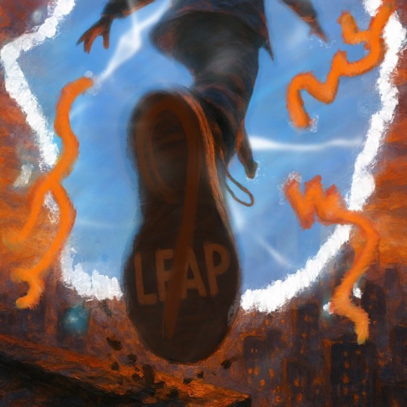
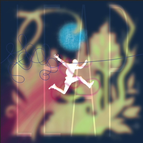
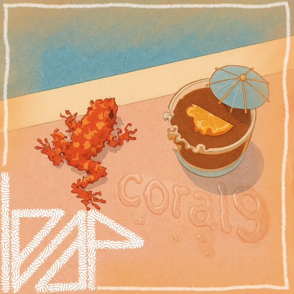
I used Procreate for early concept work and moved into Illustrator for the final logo and layout. The EP cover is a blend of digital painting and graphic elements—expressive, layered, and intentionally a little raw, like the music itself. This was a very fun project because throughout the process I was able to contribute more to their project than expected, because I was able to make them a single EP cover, a seperate album cover and their new band logo.
Final Work
The final result is a set of visuals that feel deeply connected to the band’s voice and story. The single EP cover and album cover capture the emotional tension and release that runs through their songs—abstract, but grounded in feeling. The logo is clean and adaptable, but with a handmade feel that makes it uniquely theirs. I'm incredibly proud of what we've made together and I look forward to working with them in the future. I would highly recommend their music to anybody, my favorite song by them is Crazy Eyes.